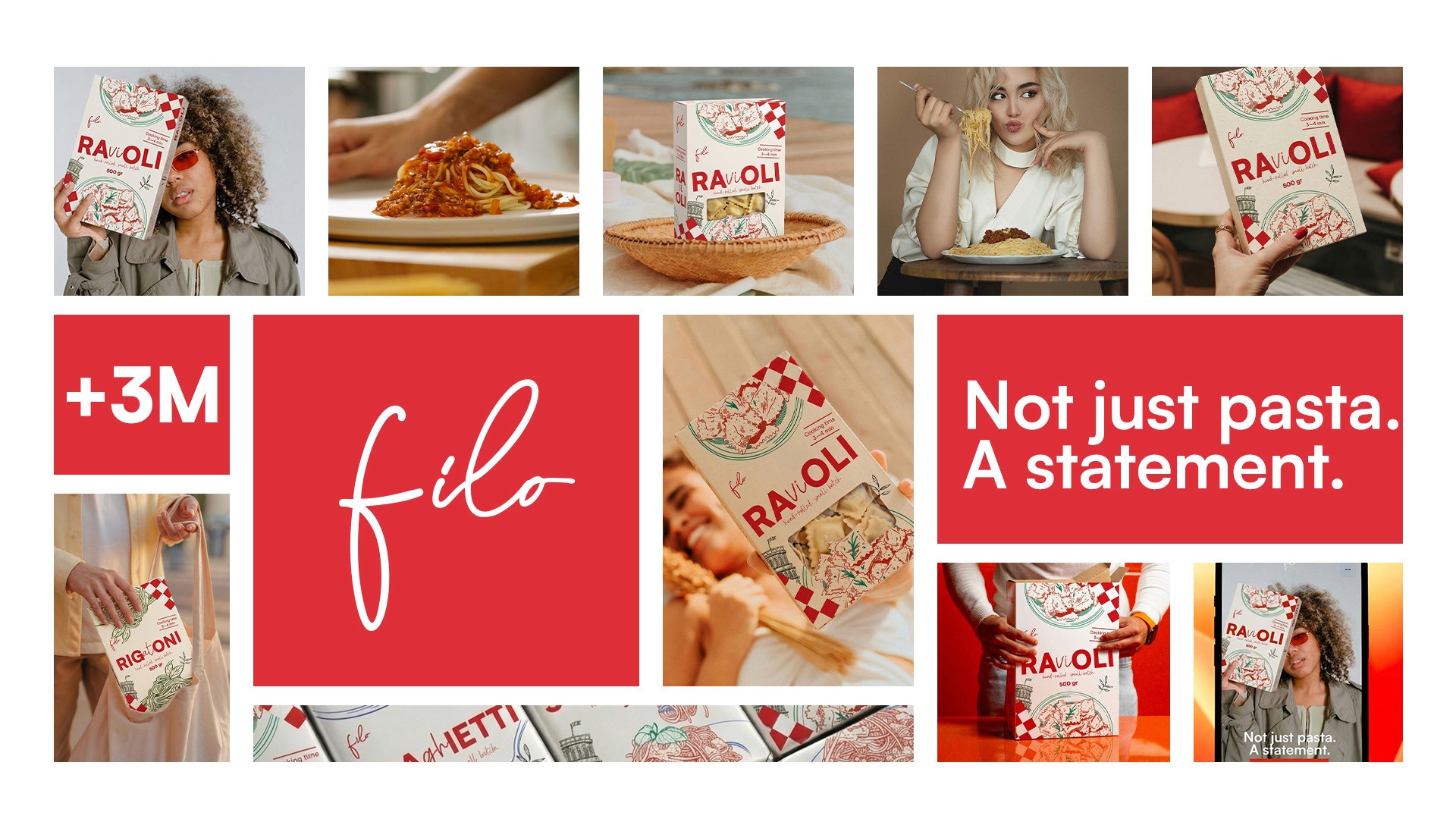
Filo — Artisan Pasta Brand Identity & Packaging Design
COMPANY
Filo
ROLE
Product Designer
EXPERTISE
YEAR
2026

A concept brand identity and packaging system for a handmade pasta manufacturer that treats a humble product as what it actually is — an object of desire.
APPROACH A bold, unexpected visual language built around the conviction that pasta doesn't have to look like pasta. No beige. No Italian flags. No grandmother in a kitchen. Just a brand that takes the craft seriously enough to dress it accordingly — red as the signal, white as the canvas, and a touch of green that carries the freshness of local flour and small-batch production without ever feeling rustic.
VISION A complete brand and packaging system designed for the person who buys food at a market, gives it as a gift, and notices the difference between something made with care and something made at scale.

Pasta packaging has been telling the same story for decades. Beige cardboard. Rustic typography. A window cut into the box so you can see the product. Safe, predictable, and completely interchangeable on a deli shelf.
THE GOAL create packaging that makes pasta feel like the most covetable thing in the room — because when it's made this well, it deserves to be.
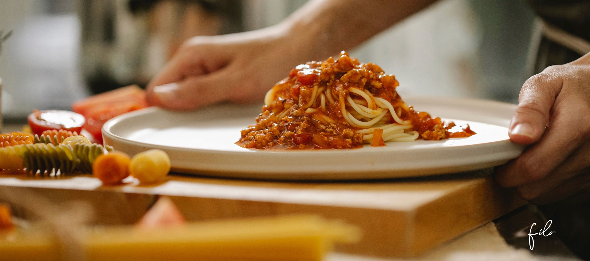

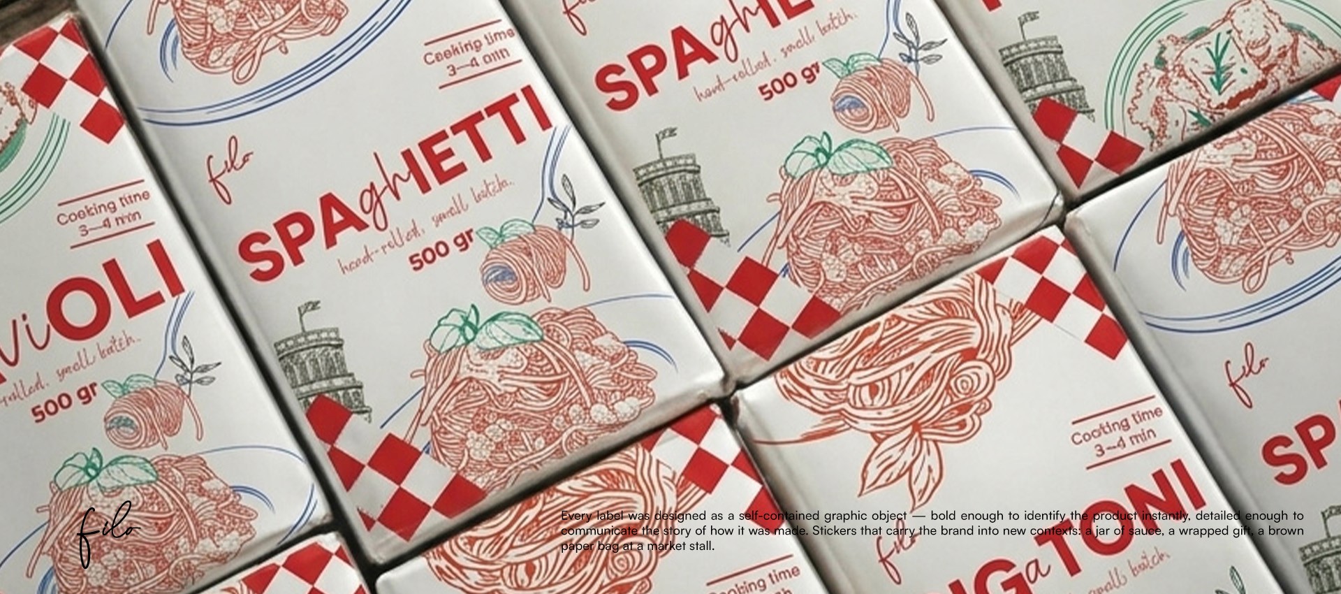
Filo, a pasta identity that doesn't look like a food product — it looks like something you'd want to own before you'd want to eat it.
SOLUTION A complete visual system built around bold red, clean white, and a touch of soft green — graphic enough to stop you at a market stall, considered enough to make a beautiful gift, and honest enough to match the quality of what's inside.


Filo was built with one belief: that handmade food deserves handmade attention — and great design is just another form of craft.