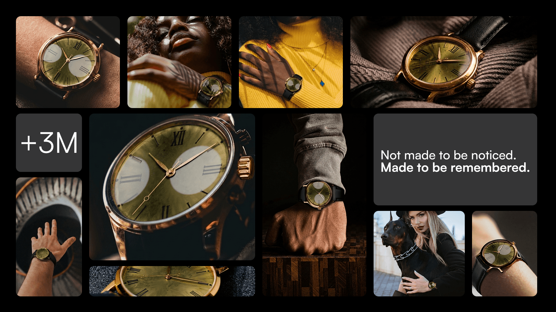
Aurem — Luxury Watch Brand Identity & Marketing System
COMPANY
Aurem
ROLE
Product Designer
EXPERTISE
Product Designer/ Brand Designer
YEAR
2026

A concept brand identity and marketing system for a watch brand built for people who don't need anyone to know what they paid — because they already know what they have.
APPROACH A dark, editorial visual language built around the conviction that true luxury whispers. Gold as the only accent that matters — precise, warm, and used with the restraint that separates genuine quality from performance. Black as the foundation that makes gold feel earned rather than decorative. A system that speaks to the customer who reads Hodinkee, knows the difference between a movement and a mechanism, and has no patience for brands that mistake loudness for confidence.
VISION A complete brand and marketing system designed for the person buying their first serious watch — or their second. Someone who has done the research, made the decision quietly, and expects the brand to meet them at that level.
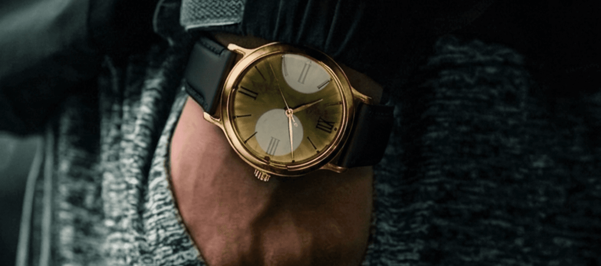
The luxury watch market communicates in two registers: heritage brands that rely on decades of reputation, and accessible brands that compensate with volume and visibility. Neither speaks to the customer who wants genuine craft without the performance of wealth — the person for whom discretion is not a compromise but a preference.
THE GOAL create a brand identity as considered and unhurried as the watches themselves — one that earns attention through restraint, not spectacle.




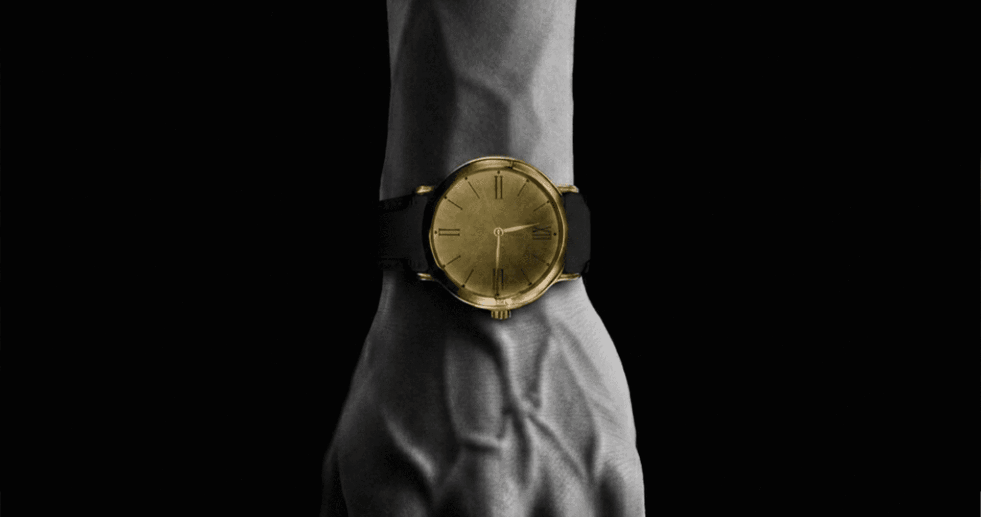
The heart of the project. Every visual treatment of the Aurem watch was designed around one principle: get out of the way and let the object speak.
PRODUCT Clean compositions. Considered lighting. A layout system that treats every product image as a study in craft rather than a sales tool. The watch is never styled — it is presented. Never glamorised — it is documented. The kind of product photography that makes you want to hold the thing in your hand before you've read a single specification. Because when the product is this good, the design just needs to know when to stop.
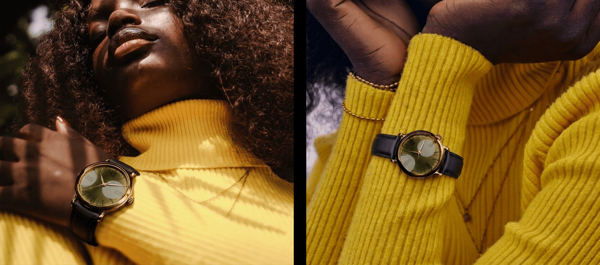

Aurem, a watch brand identity that understands one thing above all else: the right customer doesn't need to be convinced. They need to be found.
SOLUTION A complete visual system built around black and gold — not as decoration, but as the precise visual language of something made properly and priced honestly.
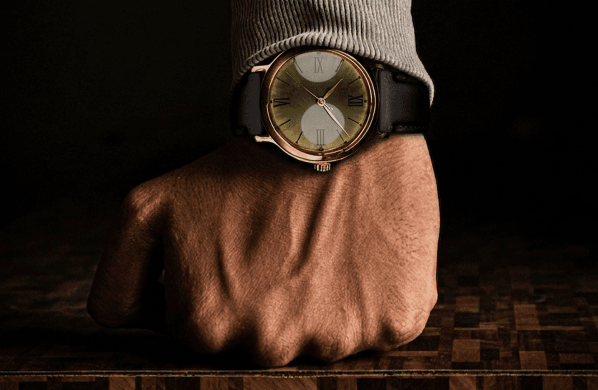

Aurem was built with one belief: that the most powerful thing a luxury brand can do is make the right person feel like it was made specifically for them — without saying a word to anyone else.
You can reach me at:
martawasilewskacontactt@gmail.com
Marta Wasilewska | LinkedIn